



Looking for a team that builds brand characters from the ground up? Explore our branding and advertising services, or visit the homepage of SmartFish Designs to see the work we do across India, Dubai and Europe.
Quick: how many brands can you name before you read the logo? A girl in a polka dot dress. A maharaja with folded hands. A small pug trotting after a boy. Most of us named the brand before we finished the thought.
That is the real job of a mascot. It gives people something to notice on a crowded shelf, something to remember after an ad break, and something to link with a feeling. Years later, one character can bring back an entire afternoon.
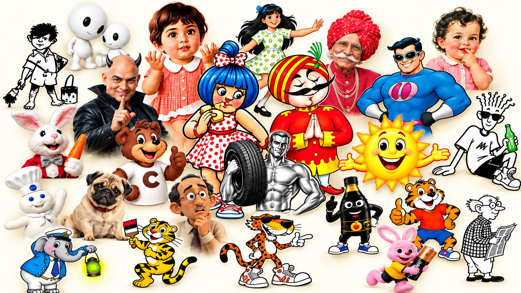
Below are 25 Indian famous brand mascots and advertising icons. Some are Indian brands, some international brands that became part of everyday life here, and two are broader personalities rather than fictional characters. Dates are either a debut or a documented period of use, as labelled. Where a brand’s own timeline differs from other accounts, we say so.
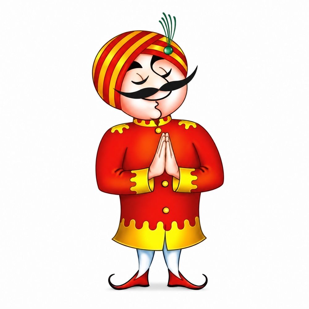
The folded hands and magnificent moustache carried a message of hospitality. Air India used a character to say that flying was a warm, respectful experience, not just a transport service. Travel brands often lean on a welcoming figure for exactly this reason. The character sets the tone before the passenger has even boarded.
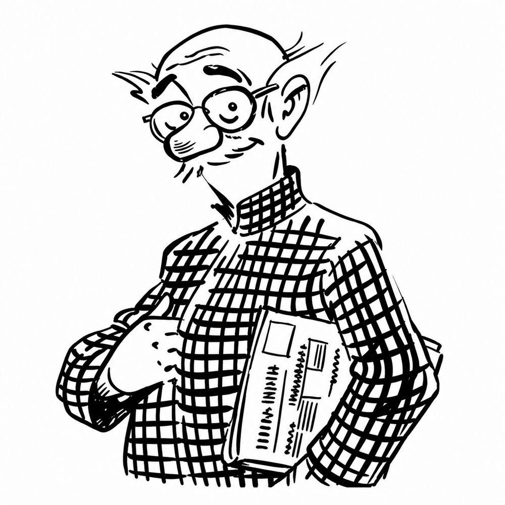
The Common Man is a cartoon figure rather than a brand mascot in the strict sense, but his impact on Indian advertising and public conversation is hard to ignore. The checked coat and quiet bewilderment captured the everyday reader’s view of the news. A character that reflects the audience’s own perspective can outlast its original purpose.
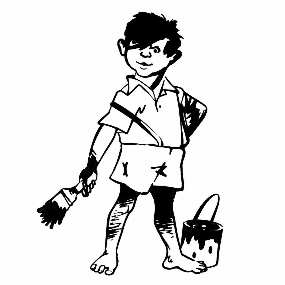
Bare feet, untidy hair and a dripping brush. Gattu looks like someone who actually works with paint, which is the point. The character made the product’s purpose instantly understandable. A good mascot often shows a task rather than a personality trait, and that makes it easier for the audience to connect the character with the product.
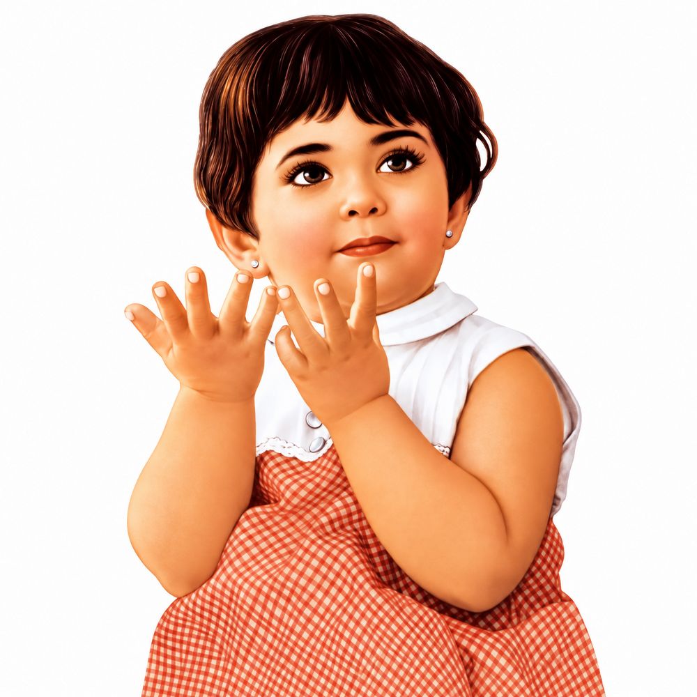
She has appeared on packaging for decades, and that matters more than any single ad. A mascot that lives on a biscuit pack gets seen every single day. For a brand, the packaging is the advertising, so the character has to read clearly at a glance, even on a wrapper someone is holding with one hand.
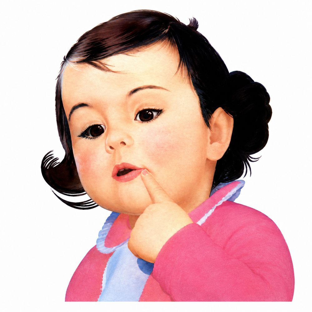
The thoughtful baby belonged to an era when the radio sat in the middle of the living room. The illustration is calm and warm, which suited a product that was a family’s shared object. A mascot does not always need to be loud. Sometimes the right character is the one that feels like it belongs in the room.
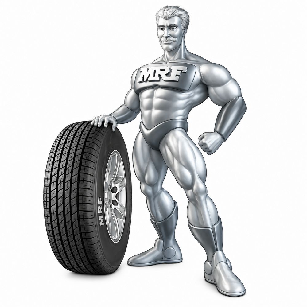
ength and reliability in one posture, which is a useful lesson for any brand. A mascot that visually represents the product’s core promise does more work than a generic friendly face.
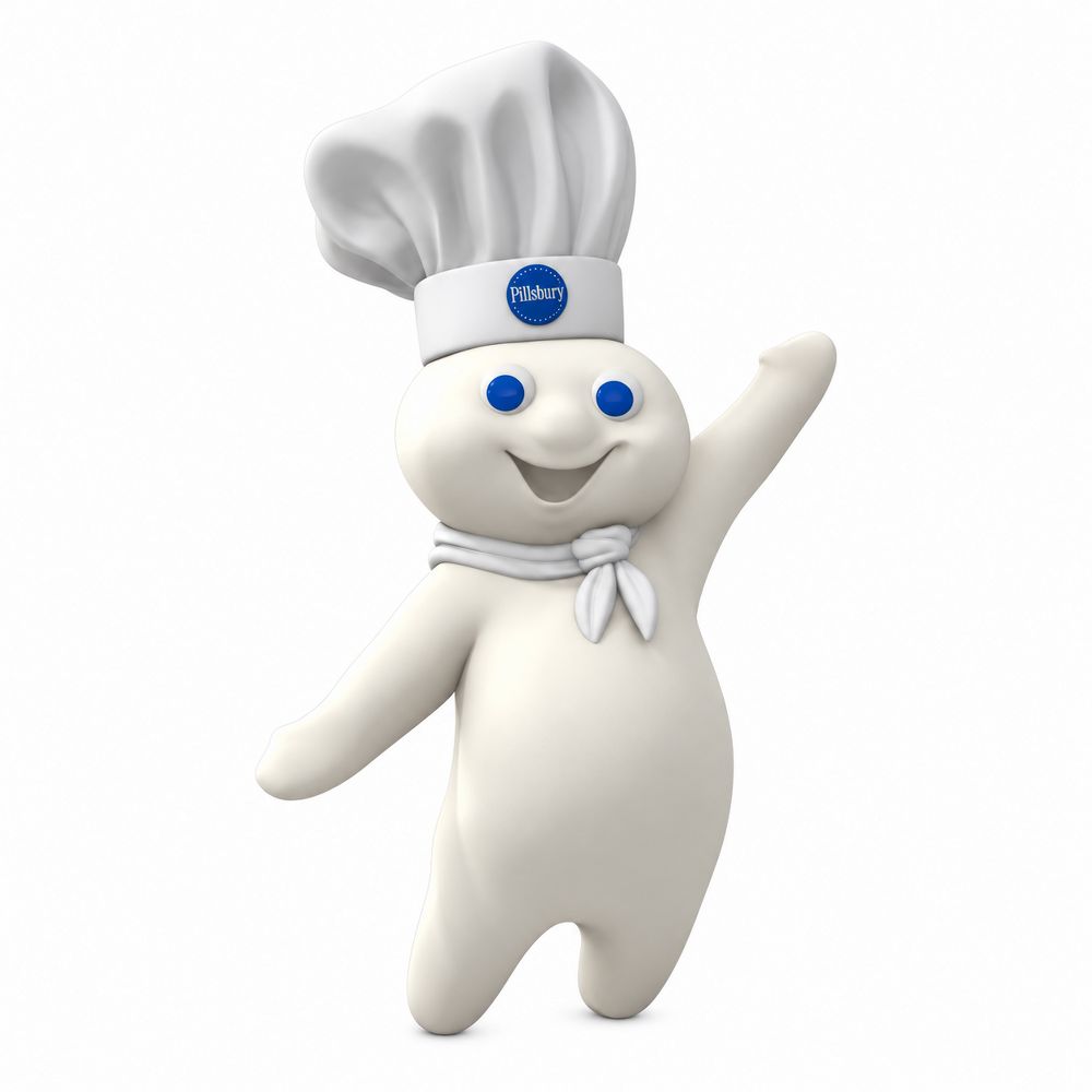
Pillsbury’s chef is a global original, and his giggle was instantly recognisable. In India, the character became part of atta commercials that made everyday cooking feel warm. Sound, not just shape, can anchor a mascot. A signature sound or phrase gives people a second way to remember the character.
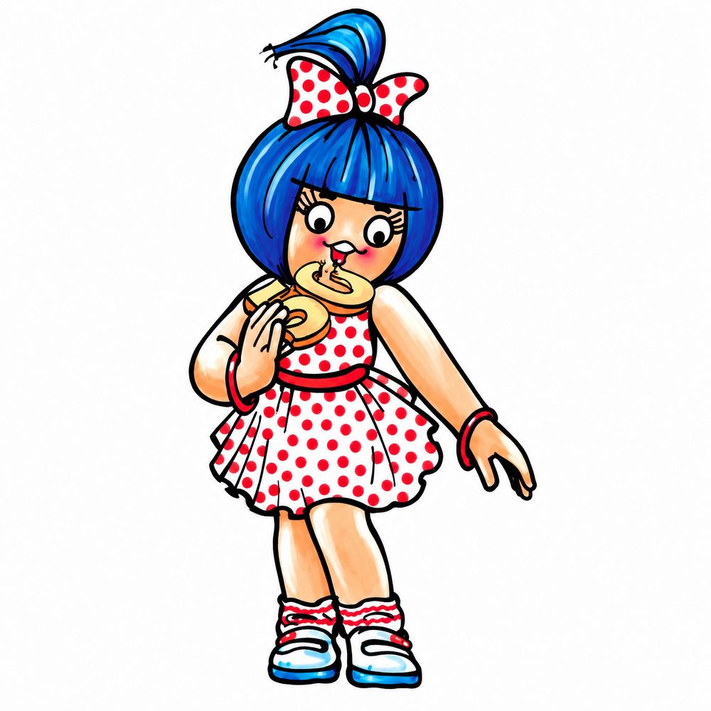
Few characters have stayed this consistent for this long. The polka dot dress, the buttered bread and the cheeky line have carried through decades of hoardings. What works here is simple repetition with a sharp, topical voice, which is why people still stop to read the ad. If you have ever smiled at a roadside Amul hoarding, you already understand mascot design.
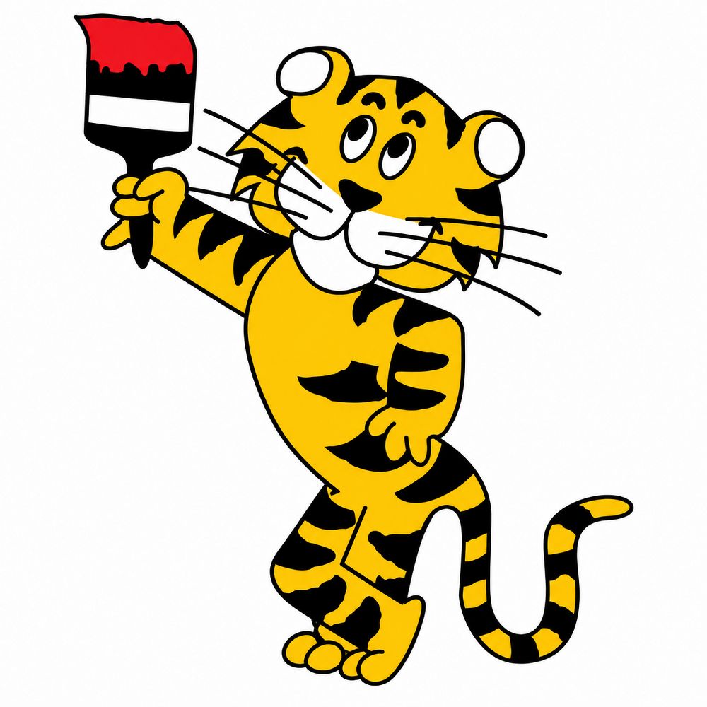
Goody was introduced in 1970, according to the company’s then managing director, and redesigned in 1972. Other design accounts place the tiger around 1971 to 1972, so the early dates are best read as a range. The paintbrush in paw gave the character a clear job. Paint brands that show the tool, not just the finish, help customers picture the result.
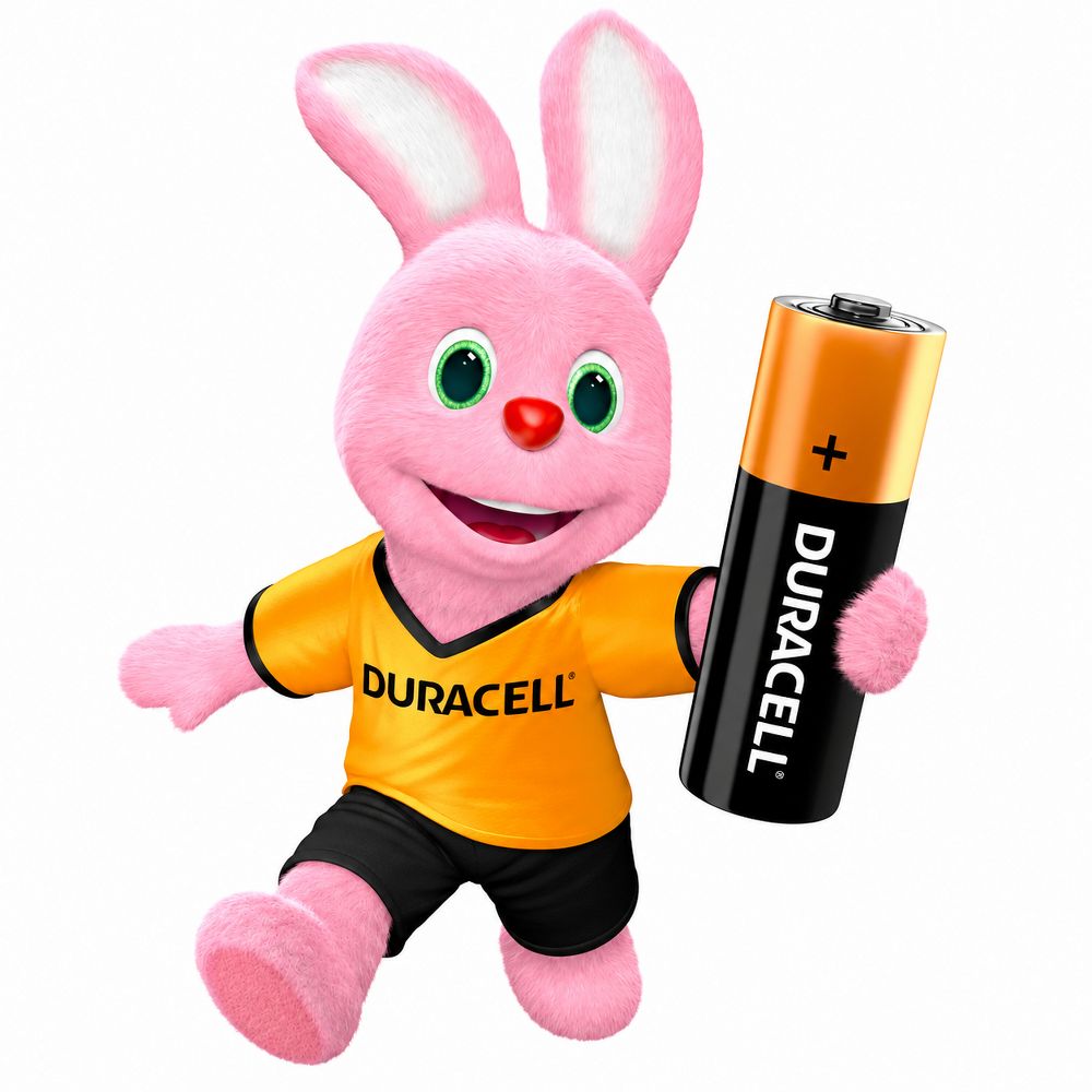
The tireless pink bunny became one of the best-known symbols of endurance in advertising. The idea was simple: the product keeps going, and so does the character. Duracell turned a technical promise into a personality. That is the standard any product mascot should aim for.
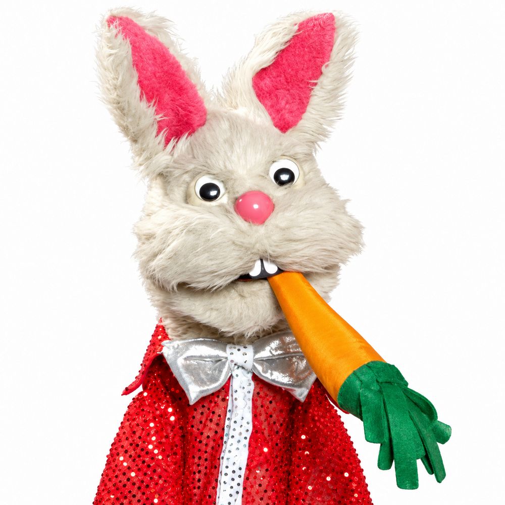
The chuckling rabbit sat well with Doordarshan-era family life. Lijjat’s character worked because it felt friendly rather than polished. Food brands often benefit from a character that smiles easily, since the emotional link to family meals does most of the persuading.
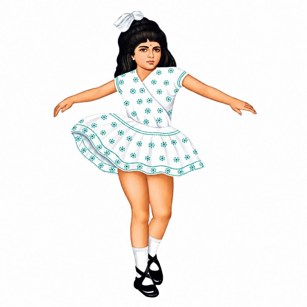
The twirling white frock became a household shorthand during Nirma’s television years. Motion made her memorable. In mascot design, movement is a strong tool because it grabs attention in a fraction of a second, long before a viewer decides whether the product matters to them.
The horns and knowing grin were a clever bit of tension. He looked mischievous, but the message was about getting a good television at home. Playful characters can carry a serious purchase decision if the humour lands in the right place. Onida’s devil shows how a mascot can make a big buying decision feel a little less heavy.
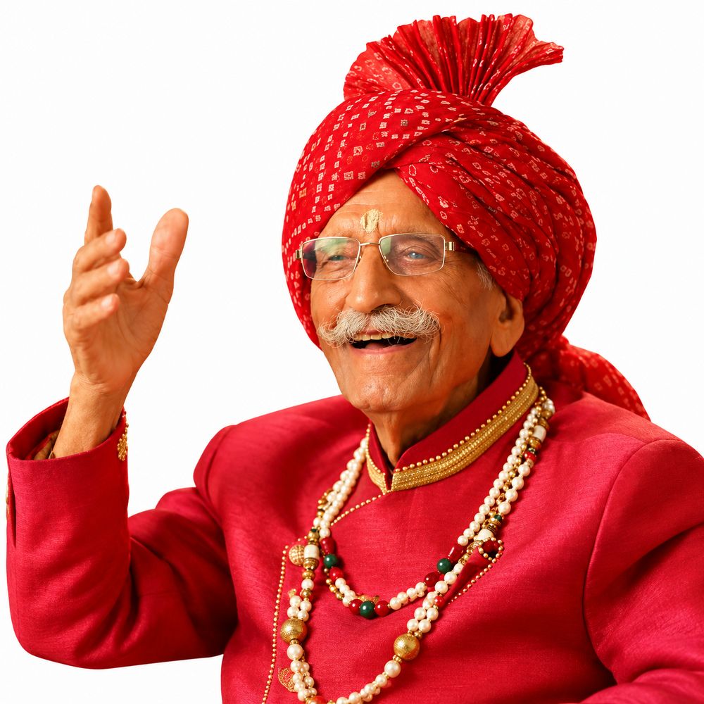
This one sits slightly outside the usual mascot list. The founder became the face of the brand, and his red turban and reassuring smile turned spice packets into something that felt personal. Founder-led branding works when the person is trusted and consistently present. It is a reminder that a mascot can be a real human, if the brand gives that person a clear role.
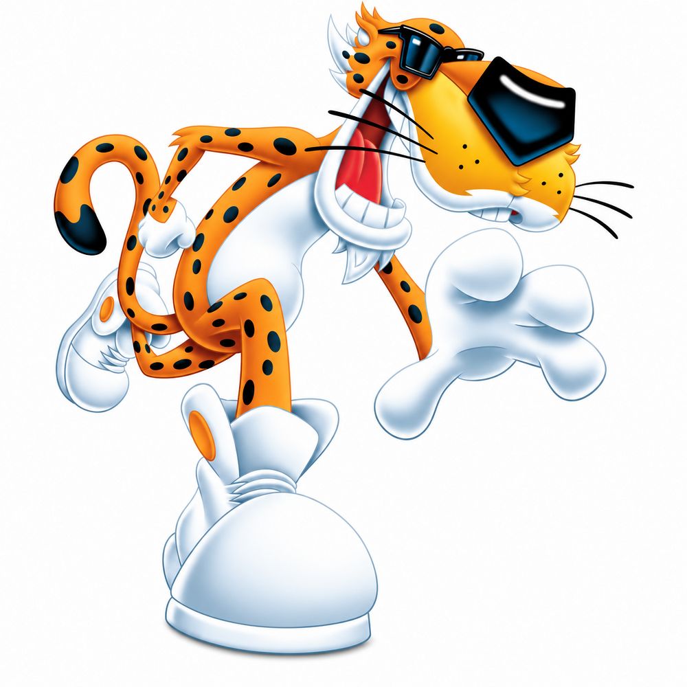
Sunglasses, oversized sneakers and a bit of mischief. Chester made a snack feel cool without needing to explain why. The character was global from the start, which is worth noting: a strong mascot idea can travel across markets if the personality is clear and the visual is distinct.
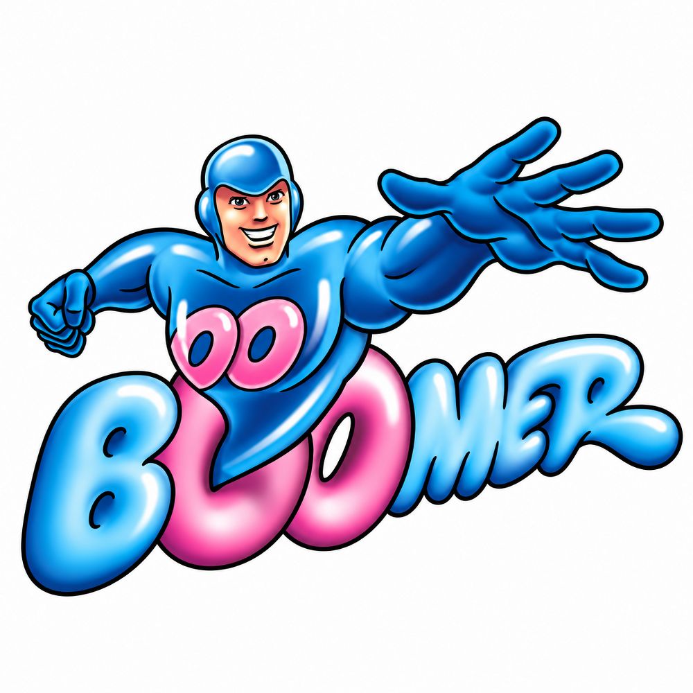
The stretchy blue superhero belonged to the playground economy of pocket money and bubble competitions. Boomer’s Indian advertising era is documented, but its first mascot appearance is not a verified date, so we describe it as a period rather than a debut. For a brand targeting children, a character that feels like a hero is a strong lever.
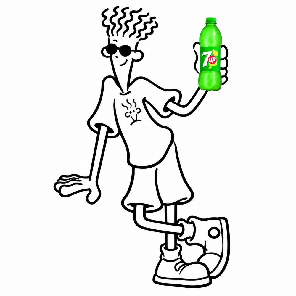
Scribbled hair and a relaxed attitude made Fido Dido the embodiment of cool. The character matched the brand’s youthful energy without trying too hard. A mascot’s attitude should match how the brand wants to be seen, not how the brand wishes it could be seen.
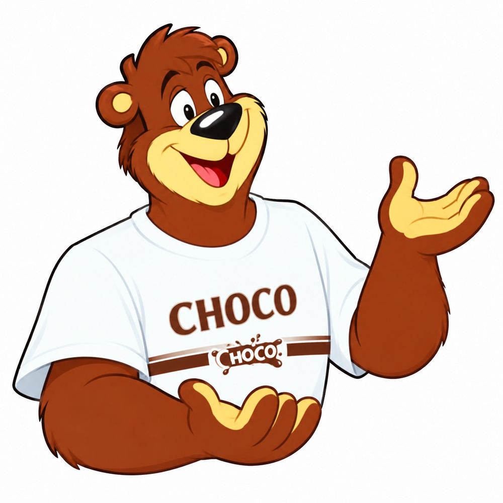
Chocos launched in India in 1996, and the bear era is widely documented as running to 2005, when the monkey character took over. Choco turned a bowl of cereal into a school morning reward. Mascots can also tie a product to a daily routine, which is one reason cereal brands invest in characters that children remember for years.
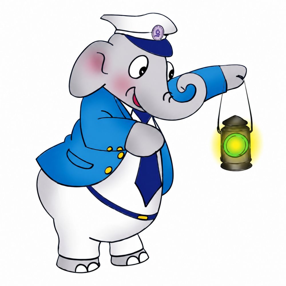
Bholu was unveiled on 16 April 2002, according to contemporary reporting. The blue uniform and green lantern made a national institution feel approachable. Government and public-sector brands can gain a lot from a friendly character, because it makes a large, complex organisation easier to trust.
The smiling sun was introduced with Sunfeast’s launch campaign. A simple, bright shape is easy to reproduce on biscuit packs, hoardings and social posts. Simplicity is one of the most underrated principles in mascot design. If a child can draw it from memory, you have a head start.
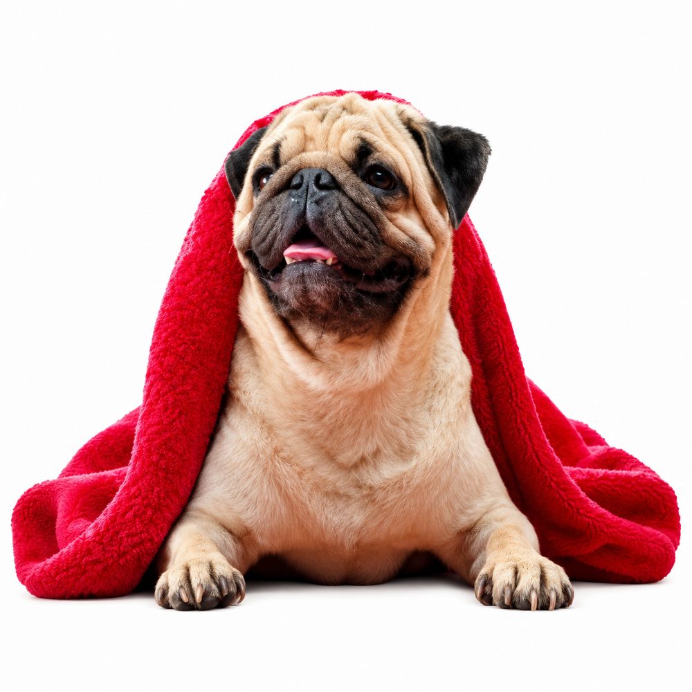
The loyal pug followed people around, and that was the message. Hutch’s You and I campaign used a dog that stayed close to the customer, which made network coverage feel like companionship. Storytelling mascots can carry a service idea that is otherwise hard to show on screen.
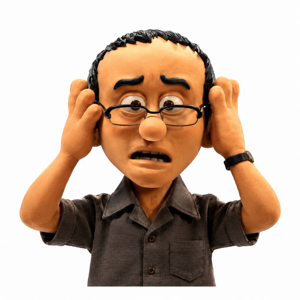
The worried expression was a smart choice for insurance. Chintamani’s concern mirrored the audience’s own unspoken anxieties about money and the future. Clay animation gave the character a handmade feel that stood out from the glossy finance ads around it. Financial brands often struggle to feel human, and a character can do that work.
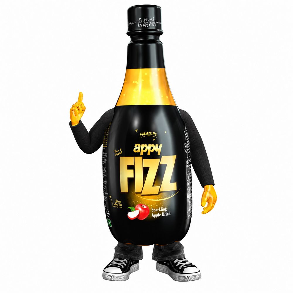
A bottle with opinions. That phrase captures why Appy Fizz became a character rather than just a package. Giving an inanimate product a personality is a common route for beverage brands, especially those targeting young audiences who expect brands to speak to them directly.
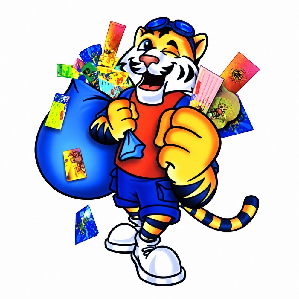
The 2008 date refers to a documented animated campaign, not the character’s first appearance, and we label it that way. The energetic tiger linked glucose biscuits with playtime and small rewards after school. Energy is an easy mascot trait to explain, which helps when a product is about everyday fuel.
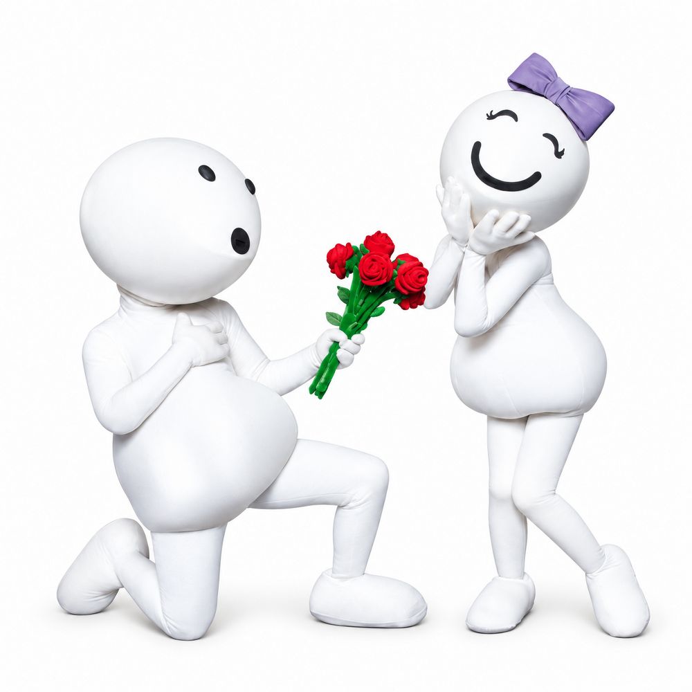
The egg-shaped characters turned cricket ad breaks into something people waited for. They were built around small, everyday mishaps, which made them easy to talk about the next morning. Group mascots like these work well when the situations are relatable and the characters stay simple enough to draw quickly across formats.
Across these 25 characters, one pattern stands out. Familiarity beats cleverness. The characters that lasted did one thing very clearly. A paintbrush suggested a painter. A pug suggested loyalty. A sun suggested brightness. The best mascots answered a simple question quickly: what does this brand feel like?
Mascot design in India also has to work across very different contexts. A character might appear on a small biscuit wrapper, a bus shelter, a cricket ad break and a phone screen in the same week. That means a mascot needs a strong silhouette, a clear colour palette, and a personality that survives being drawn by different people on different budgets. We see many brands create a character that looks good in a single presentation but falls apart on packaging or in a three-second social video.
If you are thinking about a mascot for your brand, start with three questions. What job should this character do? Where will people see it most often? Can it be drawn quickly, cheaply and consistently by someone who has never seen the original file? If the answer to any of these is unclear, the character is not ready yet.
Which are the most famous brand mascots in India?
Amul Girl, Parle-G Girl, Gattu, Chintamani, Bholu the Guard and Duracell Bunny are among the most widely remembered, though recall varies by generation and region.
Why do brand mascots work so well in Indian advertising?
Indian audiences have long connected with characters that feel warm, familiar and easy to relate to. A mascot can carry a brand across languages and regions without needing a long explanation.
What makes a good mascot design?
A clear role, a simple shape, a consistent personality and use across packaging, advertising and digital content. Looking appealing is only the starting point.
At SmartFish Designs, we help brands turn positioning into a recognisable visual identity, and a well-designed mascot is often a powerful part of that. If your brand needs a clearer personality, explore our branding and advertising services and see how we approach character and identity work.
Disclaimer: Brand names, mascots and logos belong to their respective owners. Images are illustrative recreations, not official brand artwork, and no affiliation or endorsement is implied.
Wondering how a brand currently shows up in AI-driven search and conversation? That’s the kind of audit Smartfish Designs runs for clients. Get in touch to take a look.

Since 2007, SmartFish Designs has helped brands across 20+ countries grow through branding, websites, digital marketing and AI SEO, led by founders with deep design and technology roots.
[vc_row][vc_column][vc_raw_html]JTNDaWZyYW1lJTIwd2lkdGglM0QlMjI2MDAlMjIlMjBoZWlnaHQlM0QlMjI4NTAlMjIlMjBzcmMlM0QlMjJodHRwcyUzQSUyRiUyRmVycC5zbWFydGZpc2guY28uaW4lMkZmb3JtcyUyRnRpY2tldCUyMiUyMGZyYW1lYm9yZGVyJTNEJTIyMCUyMiUyMGFsbG93ZnVsbHNjcmVlbiUzRSUzQyUyRmlmcmFtZSUzRSUwQQ==[/vc_raw_html][/vc_column][/vc_row]
We use cookies to improve your experience on our site. By using our site, you consent to cookies.
Websites store cookies to enhance functionality and personalise your experience. You can manage your preferences, but blocking some cookies may impact site performance and services.
Essential cookies enable basic functions and are necessary for the proper function of the website.
These cookies are used for managing login functionality on this website.
Statistics cookies collect information anonymously. This information helps us understand how visitors use our website.
Google Analytics is a powerful tool that tracks and analyzes website traffic for informed marketing decisions.
Service URL: policies.google.com (opens in a new window)
You can find more information in our Cookie Policy and .